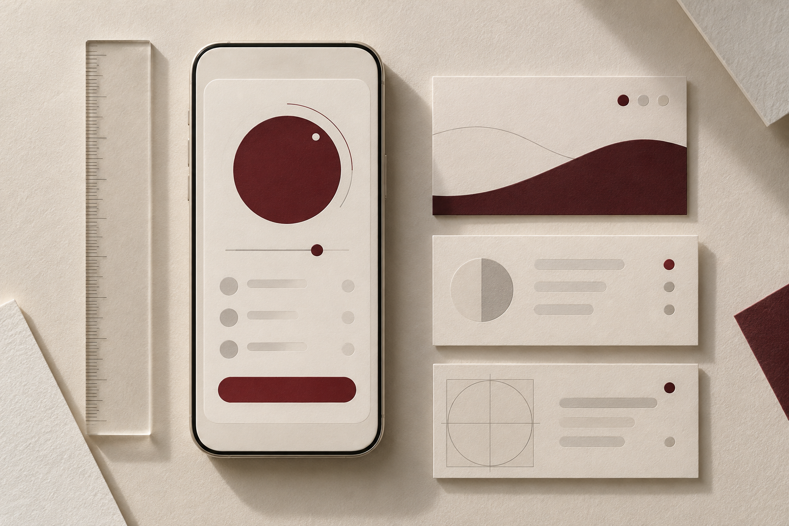
A premium interface begins with respect for attention. A person should immediately understand where they are, what matters on the screen and what will happen after a click. Decoration cannot compensate for weak structure.
A glossy magazine offers a useful editorial discipline: one lead story, clear sections, a strong image and space between ideas. In working software, that principle means highlighting the main action and removing competing focal points.
On mobile, readable text, sufficiently large buttons and a consistent page structure matter especially. A simple check is to ask someone to find a story, open it, save it and return. If they become lost, improve the journey rather than adding animation.
An original editorial article. Recommendations reflect the FALCON JOURNAL approach and are not independent test results for a specific product.
Discussion
What do you think? Share your experience or ask a question.
Reader-provided name; not verified by the editors.
Loading…